Friday, 28 January 2011
Other Ideas From using photoshop and by making the image more presentable. From using photoshop and making the background a constant colour of grey (from the original image) shows the definition and clarity of the drummer, by doing this it will attract the audience as they get drawn to the image of the drummer.
By using photoshop I have removed the background and replaced it with a Red background, whilst looking for an appropriate colour.
From using just a colour as a background ensures that the audience will just be looking at the main image and not be distracted by other objects in the picture.
I personally feel red does not go with the image and presents us with negative connotations of danger and anger from a positive and exciting music magazine.
This is the original Picture that I took for my magazine. The direction of the angle I took my image is different and exciting as the audience can clearly see that the drummer is half way through drumming and that its not a fake posed picture (from the blured sticks and symbol). This relates to the real and 'close and personal' information and images which will be shown in my magazine.
Friday, 21 January 2011
Music Magazine Photos
I took a wide variety of Music Images which I thought could be suitable to use with my Music Magazine
This Image dipicts a fun social environment which music brings people, also showing that the magazine is a fun and sociable past time.
Mid shot of a guitarist with concetration on his face whilst playing the guitar. I have also ensure that I took the image in the right third so I can lay out a 'potential' front cover in a professional way.
A low angle shot looking down on a drummer with the correct angle so the audience can see all the drums and symbols to make it more of a musical and fun image.
A smile on the singers face to also show a positive atmosphere which would be portrayed within the magazine. I feel this image cannot be used on a front page, as it is too far away for the audience to get a feel of the emotion of the singer and there is to much background imagery which take the focus off the main symbolised image which I want the audience to see.
I still tried to ensure that the picture I took was in the thirds structre, by having the drummer in the centre and each symbols in the right and left third.
I would not use this for my magazine front cover as it is to far away and does not portray a fun, positive and exciting front cover as most music magazines are such as; Kerrang and NME.
Friday, 14 January 2011
Student magazine Initial Ideas and Photos
All of these photos was taken in the form of 'thirds' and I was ensuring to either have a central image or a image which was taken in the right third so I was able to apply coverlines and additional information to the left hand side of my magazine.
Whilst doing this I was also trying to make space for the top of the image to leave room for me to had a masthead with enough room for size, colour and additional imagery which may be included or added around the masthead
Whilst doing this I was also trying to make space for the top of the image to leave room for me to had a masthead with enough room for size, colour and additional imagery which may be included or added around the masthead
Student magazine proposal
Proposal
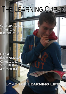
My magazine is targeted towards college students, specifically South Downs student’s. These all range from the ages of sixteen to nineteen, the reason for this is because fulfil more of the college population. By connecting to this specific part of the audience I was able to create a dominant reading, reason for this is because they are able to connect to the text and agree.
The magazine will be about current educational information and recent news about South Downs College for example new events that occur and opportunity for participation such as enrichment courses. There will also be updates and information on music, sport, fashion and food. The reason for this is because it will be more interested to the audience and will make them want to buy the magazine again.
I have also ensured that my cover lines are memorable and have a positive ring to them. With this in mind I have came up with one of the cover lines “Quick Easy Tips On Revision!” Also including the exclamation mark shows that this is a big positive interesting topic (exclamative), this makes it more likely for the audience to pick up the magazine and read that article. This relates to my target audience with the fear of the examinations coming up.
The title of my magazine is “The Learning Curve” the reason for this is because it is a pun and it relates to what goes on in South Downs College with the learning that takes place. Whilst developing my magazine I cam across many different magazine titles such as SDC and Motivated. The reason I discarded these from my choices of title is because I feel they do not portray the element of intelligence of college or the excitement such as a pun.
Throughout experimenting with fonts I have came across a wide variety of unique and memorable fonts, but I had to ensure my font suited to the theme of the magazine.
I have chosen the title font of ‘The Learning Curve’ the reason for this is because it shows the modern and intellectual factor, for this I think it is more suited to my target audience.
I have chosen the title font of ‘The Learning Curve’ the reason for this is because it shows the modern and intellectual factor, for this I think it is more suited to my target audience.
I decided to follow this font through for a constant recognisable magazine.
I also have included a tagline that will also be memorable so when my target audience hear or read the name ‘The Learning Curve’ my tagline will be remembered and recognised. ‘Love The Learning Life’ is my tagline; this is set in alliteration that creates a memorable effect. Therefore makes it more likely for the audience to remember the magazine.
My magazine will be published monthly starting from the September month to the end of July. The reason for this is because it follows the academic year that relates to my target audience of college students.
I will be creating imagery that involves students looking enthusiastic and happy on my front cover to create a good positive effect for my magazine. By taking a picture with students looking happy with a positive mise en scene where the students are looking happy and also directly into the camera, this will be set in main reception for clean and bright scenery.
The frequency in which my magazine will be published is monthly; reason for this is so I have enough time to gather more, new and relevant information for my target audience. This also creates a high chance for more of the audience to purchase the magazine, as it is not something that is such a regular occurrence.
The dimensions that my magazine will be produced is 28cm by 21cm, following the same dimensions as a regular magazine. The reason for this choice is because Current magazines with these size dimensions have done well in the current market. It is also a suitable size for personal use such as putting it in handbag and its ergonomically designed to suit the average persons hands.
Friday, 7 January 2011
Photoshop Frontcover
As I am experimenting with photoshop, I create practice front covers to ensure my music magazine front cover will be high quality and that it will show all the new and the professional features with photoshop.
Magazine production
- My genre of music that I will use for my magazine will be rock, the reason for this is because I have more knowledge of this genre of music and have experience through reading Kerrang.
- Throughout the years Rock music has been massive with a large fan base, with such bands ACDC, Motorhead and Black Sabbath making their mark on history. Therefore I wish to create my magazine on well-known and popular music base.
- Kerrang is a current magazine being published in this genre
- Also the music channel Kerrang is linked with this where they show all the music shown in this genre.
- Kerrang Radio is also accessible through the radio and the website
- People represented in this genre are an age range of around 14 – 20 as they include concert information and also festivals, this shows that the older generation must be an audience. The very outgoing and people who can relate to the music and lyrics and have a common stereotype known as a ‘emo’.
Bauer is the producer for kerrang, with a big reputation for producing big-labelled magazines such as; Empire, ZOO and FHM.
With this high credibility also connects to the audience so they know that the magazine is high quality and it is worth purchasing.
With this high credibility also connects to the audience so they know that the magazine is high quality and it is worth purchasing.
- Kerrang Magazine cost me £3.20, this is a reasonable amount for the magazine as it is produced weekly so it will hold a lot of information and other additions, such as posters and quiz’s.
- Kerrang magazine is published weekly and out every Wednesday, keeping to this day for publication and selling, allows it to evolve around the buyers lifestyle and routine to ensure they know when to get it and how to get it.
- Averagely Kerrang has about 60 pages. This is because it is a weekly magazine therefore needs to hold the weeks information and ensure that they are getting there moneys worth.
- Kerrang magazine is aimed at male and females aged around fourteen to eighteen. The reason for this is because the information and imagery used portrays the older teenage generation and shows information on up coming rock concerts which usually only allow people of the age of fourteen and over.
Subscribe to:
Comments (Atom)


