Throughout the preliminary taske I only just knew the basics of how InDesign and Photoshop worked and how to use the tools involed, but this was a good learning process for me as it helped me to develop a much more professional final product.
The use of colour to connect to a certain readership and how to position images and text in the correct places, such as using the thirds and in ways which the readers can see positive connotations.
Understanding the audience was also a challenge for me for both my music magazine and the preliminary task, as many of them have different needs and interests. After the Preliminary task I was able to have a better understanding of how to connect to a specific target audience or niche audience, and this is shown in my final product as I have included information and images to only the audience between 15 to 18 and who have a general interest in music.
In comparison to my college magazine which was only produced for college students of all ages and many different interest, I had to be more specific to create a music magazine
My Preliminary task was carried out at the beginning of the academic year, where I have had no previous knowledge on Indesign or Photoshop, so learning the basics and how to use them was essiential to ensure that my music magazine had the features used to the best of my ability.


From these two images you can see how through development, I was able to take an appropiate image leaving space for coverlines and additional imagery whilst also knowning what will appeal to my target audience and what wouldn't.
I started off by playing with the tools and features on photoshop and InDesign to produce a green background shading into white and it being shaded around the person on the front cover.
From this I was able to understand my audience fully and that bright colours will not attract them, so by being more mature and professional I was able to leave the background the same to connect to my target audience.
The text that I used on the Preliminary task was also a leaning curve for me as I understood puns and how they could be used with significase to my magazine, in this case I used "EMA Scandal! Cheque your bank accout!" Using this the reader can relate to it whilst also understanding the pun which presents positive connotations and makes them want to read on.
The use of Photoshop also was a learning experience whilst coming to grip with the basics of the programme I was able to produce an image in the left third of a photo which I took but constructed into a circle, this also presents professionalism.
InDesign was also in in working progress with photoshop as I tried to understand and develop my learning to create the structure of a magazine and to ensure all the vital information has room to be shown aroud it.
The theory side to the preliminary task helped me to understand text in relation to my target audience, in this case it was college students.
I had to understand such terminology as 'colloquialism' which means words which we associate with talking for example - wotcha.
I had to understand such terminology as 'colloquialism' which means words which we associate with talking for example - wotcha.
Alliteration - The initial consonant is repeated for example, seven silly sailors, by ensuring I know how to use these linguistic tools I feel I can produce a professional magazine and be able to use this in my final music magazine.

By creating the correct connotations and images/text I have also included psychographic profiling, by understanding my audience I am able to connect to their specific needs, emotions and desires.
A way in which I showed connotation and denotation is how I included this on 'Bloodstock poster special' on the word blood I actually made it dripping in blood, the audience will be able to notice this and relate to it.
By doing this I have created ideologies/personalities for my magazine that mirror my target consumer.Throughout development I was also able to create Puffs/plugs and a main coverline, all these additions which I did not include in my preliminary task.
I was also able to understand my specific target audience better throughout research and also questionning people who come under 'my audience'.
By doing this I am able to discover first hand what they will like to see in an audience and what their interests and music tastes are, also another development I made from the previous preliminary task.
By doing this I am able to discover first hand what they will like to see in an audience and what their interests and music tastes are, also another development I made from the previous preliminary task.
I used photoshop a lot during my period of creating my music magazine and I have come across ups and downs of using this -
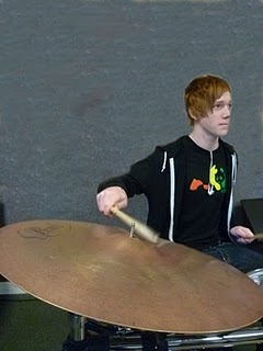

I started developing my music magazine from the basis of this picture, and I had to ensure the correct background colour correctly.
I started off with using a 'colour tool' which I learnt during my time working with photoshop with the preliminary task, and I come across different colours and blending techniques.
I felt that the first choice of background (left) was inappropiate for a music magazine with a target audience of 15 -18, as they will expect bright colours in relation to connotations of their music genre.
The image on the right is what I decided was most appropiate for my magazine, the reason for this is because it is not too childish with just one plain primary colour background and it is not too dull and mature like the image on the left.
I felt that using this colour which is the original colour but with the use of posters being removed on photoshop was beneficial as it creates the perfect balance between 'mature and childish'.
I felt that using this colour which is the original colour but with the use of posters being removed on photoshop was beneficial as it creates the perfect balance between 'mature and childish'.
Perfect for my target audience of 15 to 18.
Developing my music magazine I also took the appropiate image with the symbol in the main shot and the drummer in the background, also creating a positive feel to the magazine.
I feel that using the tools correctly I have developed a more professional and not so childish image.
This is due to understanding what my target audience expect and the ways to use the features on Photoshop.
This is due to understanding what my target audience expect and the ways to use the features on Photoshop.
Not just by adding one olour for the background, I have thought carefully about the audience and how to present a magazine professionally and I have edited the pictures 'original features' but removing all posters a part from one to increase the ecological validity of the image to the audience.
I have also gained knowledge through the theory side, throughout the creation of this magazine I have also gained knowledge on what the audience like, textual skills needed and how to ensure a image can be used efficiently. This all links to the theory side of creating a magazine, with the front cover essentials need to connect to a specific audience and the way to use these features to get the best out of your magazine and to connect to the target audience.
I have learnt all these features, with the knowledge from other members in association with an audience of 15 -18 such as Kerrang, NME and also members who are in the category.
This was all learnt through demographic profiling, about the age, religon, class and other aspects defining an audience.
Kerrang was a important part of my production of my magazine, as I used alot of there conventions and structures of a magazine.
Kerrang magazine exmaple - this shows how Kerrang base there magazine and how the structure and close up show of a musician was used also on my to connect to my audiences' ideologies and interests of music.
I feel that I have used my time well and that I have also followed the conventions of magazines in a way which has benefited my magazine as a music magazine.
I feel I have connect to my niche audiemce, with the help of developing my knowledge of photoshop and also InDesign.
I feel I have connect to my niche audiemce, with the help of developing my knowledge of photoshop and also InDesign.
The improvements shown from my preliminary magazine to my final music magazine has proven that the skills and knowledge has developed, and from this I have been able to create a modern and professional magazine which will be in interest of those who are connect to my music magazine.


