
As you can see, the design from my flat plan to my final piece is different.
With the flat plan having the article title over both pages, on this instead I have Put the name of the interviewee on the right and a large image of him on the left.
The reason for this change is because I felt more imagery is key trying to connect with my target audience. That is why I have included a light opacity image behind the article on the right. Also giving the audience a sense of a modern and 'fun' interview, keeping in relation to the connotations of my magazine, of fun exciting and colourful.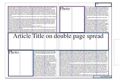

This is my original flat plan design.
No comments:
Post a Comment